But
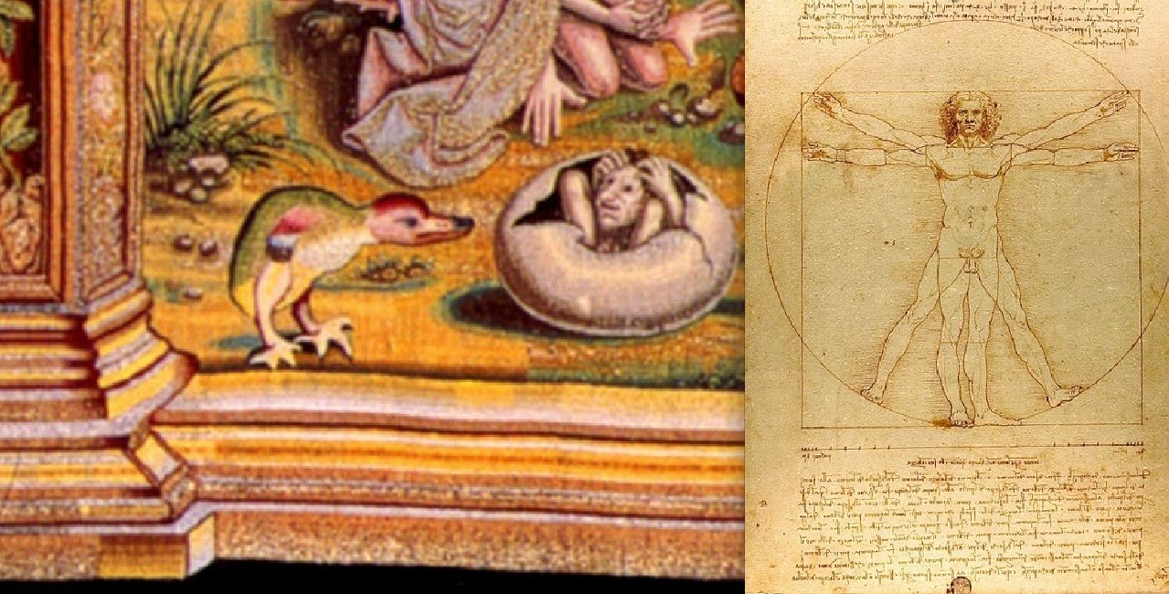
still, why make fun of Leonardo da Vinci just because his caption on a drawing
was a little imprecise? The problem may have been that another favorite of
François I was Geoffroy Tory, who wrote a book on typography, Champ Fleury, in
1529 and then in 1530 became the French king’s publisher, and who was an
admirer of Leonardo da Vinci. Did he get the job for his Leonardo da Vinci
imitations? His versions of the Vitruvian man were the ones more people would
see (even though the Leonardo da Vinci one is more famous now) because they
were in a printed book, and they are definitely creepy. The man in the letter
“O” is way too much like an execution scene. The Vitruvian man in the tapestry
may be hiding in an ink bottle.
 Geoffroy
Tory’s book also talked about making letters that represent numbers look like
pictures of people, which was more in tune with the decorative numbers in some
old handwritten manuscripts, from before the invention of printing. In The
Garden of Delights/El Jardín de las Delicias, Adam, the Creator, and Eve form a
Roman numeral VI standing for the sixth day of creation and 6-flint/tecpatl,
sadly backwards in the tapestry. In the Nahuatl chronology, fingers stand for
numbers in several places and two people’s hands with five fingers each,
forming an X, stand for the number ten, as in 10-flint/tecpatl. (Happy people,
in a swimming pool.) It seems that part of the reason the Nahuatl date signs do
not look like real ones is that they are partly made to be improvements on
Geoffroy Tory’s typography. (Few would argue today that Geoffroy Tory was a better
designer than the Italian Aldus Manutius.)
Geoffroy
Tory’s book also talked about making letters that represent numbers look like
pictures of people, which was more in tune with the decorative numbers in some
old handwritten manuscripts, from before the invention of printing. In The
Garden of Delights/El Jardín de las Delicias, Adam, the Creator, and Eve form a
Roman numeral VI standing for the sixth day of creation and 6-flint/tecpatl,
sadly backwards in the tapestry. In the Nahuatl chronology, fingers stand for
numbers in several places and two people’s hands with five fingers each,
forming an X, stand for the number ten, as in 10-flint/tecpatl. (Happy people,
in a swimming pool.) It seems that part of the reason the Nahuatl date signs do
not look like real ones is that they are partly made to be improvements on
Geoffroy Tory’s typography. (Few would argue today that Geoffroy Tory was a better
designer than the Italian Aldus Manutius.) But
what does this have to do with Saint Anthony in the desert, the subject of the
tapestry? The book about the life of Saint Anthony by Saint Athanasius is cited
in virtually everything that has been written about the painting, but it
appears that no art historian has ever read it. (The footnotes with editions
and page numbers appear to come from research on another artist, Schongauer,
and his famous print of Saint Anthony carried up in the air by devils.) But
Athanasius insisted that Anthony took a dislike to reading as a child and
memorized the Scriptures instead, just by listening carefully to people. The
person in the right panel of the Lisbon triptych is Athanasius, who had a beard
and always carried a book, and he is there because he is the writer who
transmitted the story about Saint Anthony that is shown in the left panel,
along with everything else that is known about Saint Anthony.
But
what does this have to do with Saint Anthony in the desert, the subject of the
tapestry? The book about the life of Saint Anthony by Saint Athanasius is cited
in virtually everything that has been written about the painting, but it
appears that no art historian has ever read it. (The footnotes with editions
and page numbers appear to come from research on another artist, Schongauer,
and his famous print of Saint Anthony carried up in the air by devils.) But
Athanasius insisted that Anthony took a dislike to reading as a child and
memorized the Scriptures instead, just by listening carefully to people. The
person in the right panel of the Lisbon triptych is Athanasius, who had a beard
and always carried a book, and he is there because he is the writer who
transmitted the story about Saint Anthony that is shown in the left panel,
along with everything else that is known about Saint Anthony.
Saint
Anthony was in the desert to get away from a lot of things including books, but
it was the Egyptian desert so there were hieroglyphics. One that appears both
in the Bosch triptych and in The Garden of Delights/El Jardín de las Delicias
is Horapollo’s fish eating fish. It is not in the Saint Anthony tapestry but the
tapestry does seem to include a fish eating a person and a person who has
caught a fish, and the implication is unclear. Maybe the saint was not
preoccupied with "the lawless or abominable" (which was what Horapollo said a fish
represented because fish eat fish) or not interested in Egyptian hieroglypics any more than in Latin
writing, or maybe the saints and the artists who designed the tapestry knew
that Horapollo’s hieroglypics were not real ones. Maybe Hieronymus Bosch
thought Horapollo’s hieroglyphics were devils that annoyed the saint.

This
leads back to possibly the most interesting thing about all the “Bosch”
pictures and the tapestries, which is that they may demonstrate a level of
interest in and possibly knowledge of how to interpret hieroglyphs that is not
recorded anywhere else. I think it is implied by the fact that Peter Martyr in
his Opera Omnia never discussed Egyptian hieroglyphics or Nahuatl
hieroglyphics, even though he described Maya writing a little bit. Comparing
the omissions in two areas of interest is a little like dividing by zero, but it seems
unlikely that he did not notice the similarities in the two writing systems. It
might also be that whatever was known about either Nahuatl or Egyptian
hieroglyphics may have been regarded as confidential, not for publication. A
dozen or so years later the Codex Mendoza included a proper legal certification
of the accuracy of its translation and fell into the hands of French pirates,
but there was no published handbook for deciphering Nahuatl documents.
Geoffroy
Tory’s book title Champ Fleury literally means a field of flowers, so Saint
Anthony’s desert was a likely place to put it so long as it was personified by
one of the devils bothering the saint. On the other hand, “desert” can
sometimes just mean a deserted place and so a desert might be a place with
nothing but flowery fields. The word did not always imply that a place was dry.
So champ fleury could equal desert.